It is clear from my target audiences comments that they like the colour contrast from Red and Green and the fact our artist is left of frame. I thought these colours would work well with a POP magazine as it is going against the traditional frase of "red and green should never be seen". Our artists being left of frame and the restriction sign being centre frame symbolises government restrictions controlling people.
After looking at the comments written by flickr users, I was able to understand what colours, scenery wise, should be used in a pop music video. They really like the location and costume of this shot. The second comment asks about the mise-en-scene of the housing in the background. To maintain a more rural feel for the shots I would not crop the houses out. However, I personally feel that the car in the background ruins the rural feel. When filming we will need to make sure no cars will be passing.

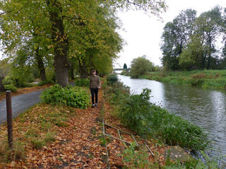
The comments written by the TA mainly speak about the mise-en-scene of the shot. They like the autum colours and rural atmosphere of the shot. I deffinatly will be using this location in the shot.

It is very clear from these comments that they really like the change of mood and emotion in this shot. The angle of the shot was also commented on again, it is very clear that the angle of the shot is perfect for some shots in our music video
The comments from flickr tel me that the right of frame and angle of this shot work well with the mise-en-scene. However, the comment about dark colours tells me that my TA want bright, contrasting colours like a stereotypical modern POP music video. I fully agree with this comment and will try to insclude a wider range of colours in the next shoot.
This comment is very helpfull as they also gave me tips about the angle of the shot. When filming in this location I will use the tips given and make sure the camera is straight so that the bridge is level. The individual who commented on this post, also said that is was a very stereotypical shot. In some shots we do want to fit with stereotypes as we want to produce a modern POP music video, targetting younger ages.

People feel that the change of location and costume was very good and suitable for the strong autum theme. One of the comments asks about why we chose to lean him against a silver birch tree. We did this to add contrast against the green, autum coloured background. In view of these comments, we now know that our target audience really likes the costume and location. Upon reflection, this shot could be improved by taking the path out from behind him and develop an apperence of our artists leaning against the side of the screen.
 This shot was loved by the TA, they really liked how you could see through the fence. More tips came from the comments, I can use these when filming for the music video. We could also use the feel of escapism to develop out concept based aspect of feeling alone.
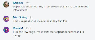
This photos comments help me with ideas for the angle of the shots. A low angle shot would work very well with the ending of the video as he will need to appear dominant and in charge. As my TA really like this shot we will deffinatly be using this in the final music video.
The TA comments on this shot tell me that it is very good and work very well with the genre. In addition, the contrast of the shot really brings out the red colour of his shirt. As our target audience and us really like this shot we will deffinatly be using it in the music video.
How This Research has Effected My Planning and Creativity:
- These comments have given me so loads of ideas for the music video
- They have also helped me finalise some shots we had been debaing wether to use.
- The TA really likes the use of a red shirt as it stands out and contrasts against the green background.
- Locations were also liked in these photos. We will need to use some of these locations in the mucis video as our TA really liked them.
- The low angle shot comments will help me throughout the video as I now understand that this specific angle of shot will work very well towards the end of the video.


An excellent post here Kenza and this will really help you to plan and complete script breakdowns. Your synergy and star image is really taking shape. A good sense of journey. Well done.
ReplyDelete