
Friday 22 December 2017
Wednesday 20 December 2017

Monday 18 December 2017

Sunday 17 December 2017

Saturday 16 December 2017


Friday 15 December 2017

Thursday 14 December 2017


Wednesday 13 December 2017


Wednesday 6 December 2017

Tuesday 5 December 2017


Monday 4 December 2017
Research: Target Audience Final Video (Group Post)
We surveyed 11 people. 9 female 2 male.
1.Do you think the kicking of the gate is relevant?
Prefered encoded reading achieved: 3 said that it announces a dramatic entrance and shows he is angry and upset.
Negotiated reading: 4 said that it is confusing as he seems aggressive but the song isn't aggressive. They also said that it gives a negative view of the video although the video is good. He is also upset and angry
Oppositional reading: 4 said it is aggressive and the song is about love coming back and he is being aggressive.
1.Do you think the kicking of the gate is relevant?
Prefered encoded reading achieved: 3 said that it announces a dramatic entrance and shows he is angry and upset.
Negotiated reading: 4 said that it is confusing as he seems aggressive but the song isn't aggressive. They also said that it gives a negative view of the video although the video is good. He is also upset and angry
2. Does the artist portray the genre well?
Preferred reading: 11 said yes. "it follows the genre due to visuals and audio matching", "the dancing and goofy singing into camera represents love", "fun and upbeat", "he is enjoying what he is doing"
Negotiated reading: N/A
Oppositional reading: N/A
3. What do you understand about the story line?
Preferred reading: 6 said "he was in a relationship that didn't work and he misses her and wants her back", "he wants to spread love and positivity", "searching and questioning love, wants love to be spread and asking a previous partner to love him again", "wants to bring love back"
Negotiated reading: 5 said "more of a concept based video to a narrative", "not sure why the strangers are there", "is he upset because love is lost between him and someone else in the video"
Oppositional reading: N/A
4. Which shot do you like the most and why?
Preferred reading: 1"hand in the shape of a heart", 3"you, you, you", 3 "change of costume in field", 1"swinging around lamppost", 1 "walking back", 2 "pan of town"
Negotiated reading: N/A
Oppositional reading: N/A
5. Do you think there were the right amount of costume changes?
Preferred reading: 6 said "effective to the character", "if there were anymore it wouldn't be right", "fun and added nice depth", "there aren't too many which is good"
Negotiated reading: 2 said "simply but not necessary", "don't think it was needed, could have been different outfits"
Oppositional reading: 3 said "should have been more obvious as the outfits are similar", didn't grab attention as they were all similar", "had little effect"
6. Which colours do you think are prominent in the colour scheme?
Preferred reading: 2 Red, 6 Pink, 3 green, 4 neutral/ browns, 1 white, 4 black/ grey, 2 blue
Negotiated reading: N/A
Oppositional reading: N/A
7. What shots do you think symbolise this video?
Preferred reading: 1 "circling the lamp", 6 "holding up the signs" , 3 "hands making a heart", 2 "hand holding", 2 "singing into camera", 1 "artist center frame"
Negotiated reading: N/A
Oppositional reading: N/A
8. How well is the artist advertised in the video?
Preferred reading: 11 said "a positive person", "main focus", "advertised well as in almost every shot", "fun and quirky", "very well", " happy and bright", "enthusiastic and happy", " a loving person"
Negotiated reading: N/A
Oppositional reading: N/A
9. Do you understand what has happened in the main characters life?
Preferred reading: 6 said "he gets happier as he finds love", "relationship problems", "breakup, hurt feelings", "had love problems", "split with girlfriend and wants her back", "really wants love"
Negotiated reading: 2 said "lack of love or maybe a lot of anger?", "some suggest he is thinking about a girl, others he is thinking about love"
Oppositional reading: 3 said "no", "not really", "video seemed concept based", "bubble with Iona in not repeated so not clear enough"
10. Do you think when the artist changes emotions throughout the video it allows you to connect with him more?
Preferred reading: 2 said "we feel different emotions so more relateable"
Negotiated reading: 3 said "all the same although emotions shown makes it constant", "I thought he looked happy"
Oppositional reading: 6 said "I didn't see a shift in mood", "no obvious change although I connect with him more when he is having fun"
Negotiated reading: N/A
Oppositional reading: N/A
3. What do you understand about the story line?
Preferred reading: 6 said "he was in a relationship that didn't work and he misses her and wants her back", "he wants to spread love and positivity", "searching and questioning love, wants love to be spread and asking a previous partner to love him again", "wants to bring love back"
Negotiated reading: 5 said "more of a concept based video to a narrative", "not sure why the strangers are there", "is he upset because love is lost between him and someone else in the video"
Oppositional reading: N/A
4. Which shot do you like the most and why?
Preferred reading: 1"hand in the shape of a heart", 3"you, you, you", 3 "change of costume in field", 1"swinging around lamppost", 1 "walking back", 2 "pan of town"
Negotiated reading: N/A
Oppositional reading: N/A
5. Do you think there were the right amount of costume changes?
Preferred reading: 6 said "effective to the character", "if there were anymore it wouldn't be right", "fun and added nice depth", "there aren't too many which is good"
Negotiated reading: 2 said "simply but not necessary", "don't think it was needed, could have been different outfits"
Oppositional reading: 3 said "should have been more obvious as the outfits are similar", didn't grab attention as they were all similar", "had little effect"
6. Which colours do you think are prominent in the colour scheme?
Preferred reading: 2 Red, 6 Pink, 3 green, 4 neutral/ browns, 1 white, 4 black/ grey, 2 blue
Negotiated reading: N/A
Oppositional reading: N/A
7. What shots do you think symbolise this video?
Preferred reading: 1 "circling the lamp", 6 "holding up the signs" , 3 "hands making a heart", 2 "hand holding", 2 "singing into camera", 1 "artist center frame"
Negotiated reading: N/A
Oppositional reading: N/A
8. How well is the artist advertised in the video?
Preferred reading: 11 said "a positive person", "main focus", "advertised well as in almost every shot", "fun and quirky", "very well", " happy and bright", "enthusiastic and happy", " a loving person"
Negotiated reading: N/A
Oppositional reading: N/A
9. Do you understand what has happened in the main characters life?
Preferred reading: 6 said "he gets happier as he finds love", "relationship problems", "breakup, hurt feelings", "had love problems", "split with girlfriend and wants her back", "really wants love"
Negotiated reading: 2 said "lack of love or maybe a lot of anger?", "some suggest he is thinking about a girl, others he is thinking about love"
Oppositional reading: 3 said "no", "not really", "video seemed concept based", "bubble with Iona in not repeated so not clear enough"
10. Do you think when the artist changes emotions throughout the video it allows you to connect with him more?
Preferred reading: 2 said "we feel different emotions so more relateable"
Negotiated reading: 3 said "all the same although emotions shown makes it constant", "I thought he looked happy"
Oppositional reading: 6 said "I didn't see a shift in mood", "no obvious change although I connect with him more when he is having fun"
Planning- Promotional Ideas Outcome
In my previous post, i saw that a video had used the album cover of the artists digipak as an end screen. I really liked this idea and are going to put it in the top right hand corner of the screen as the end title slide is scrolling through.
Track List
Alone
Back Around
Standing There
Seeing Red
Till it’s gone
Let’s talk about the future
Grey skies
Feeling Blue
Then and Now
Speaking loud
Here in time
This is now
Sunday 3 December 2017
Target Audience Research on Ancillaries 1
We asked three 17 year olds, one males and three female, to
analyse our ancillaries. This included our Advert and Digipak. I asked more
than three people originally however, these were the most useful answers.
Advert
1. They said that the forced blur around the hands needs to
look more natural as it stands out too much.
Action: we can change the opacity of the image to make the
blurs less harsh.
2. They said that the colour of the hands and the face needs
to be duller.
Action: Change the saturation of the face and hands.
3. We need to move him down as his head is cut off at the
top.
Action: move the image so all of his head is showing.
4. They did not understand the link to looking sad in the
ancillaries and happy at the end of the video.
Action: The story is he is alone and needs help. The video
is all about him finding help to spread love and realising he can live without
a girl’s love if he has people around him for support.
5. There needs to be a range of fonts used on the advert.
Action: change the fonts to suit genre but have a range of
fonts.
6. The fonts also need a variety range in colour.
Actions: add some more synergetic colours
7. They could not understand why there was a line used.
Acton: line is there to crate sections and make it easier to
read
8. There is a hole where text could go.
Action: We are going to put a picture of the album cover in
this gap.
9. The text for his name looks stretched.
Action: resize the text
10. Need to put the institution name on advert, not just
logo.
Action: Add the record name.
Digipak -
Front Cover: the image seems a bit burnt out and his name
seems too out of the way.
Action: We can do this by changing the brightness of the
colour scheme as well as desaturate some of the colours so it makes the photo
look a bit darker. We will also Move the font to in front of him and make both
"Jake" and "Moss" the same size font.
Back Cover: There is too much green, there is also no
relation with the viewer and we need a barcode, price and font.
Action: To fit with what our audience has said we could
develop a layer mask on the image and desaturate the green slightly to maintain
his brightness as well as reducing the amount of green in the image. We will
need to add the institutional details (price and barcode)
Left Cover: The image does not fit in the box and they do
not like how close up the image is.
Action: We will get the image again and crop it perfectly to
fit inside the box. The image could be brought back a bit.
Left Cover 2: The image of the hands does not fit in the
box.
Action: We will change the sizing’s of the photo of the
hands and make it fit perfectly inside.
Back Inside: Too green.
Action: we will bring out some of the colour and make the
image less green.
Cover Inside: No connection between the image and the music
video. Too similar with the back inside. Makes no connection with audience.
Action: Change the image and link it to another section of
the music video.
Saturday 2 December 2017
Planning: Our actions prior the Target audience research 6 (Group Post)
Planning: Our actions prior the Target audience research 6
What have we changed after the target audience research from draft 4?
- The banners opacity and colour has been changed. We thought this would look aesthitically pleasing so, all the boxes highlighting words have had the opacity changed to 70%.
- The size of the Digipak front cover is alot smaller now.
Friday 1 December 2017
Research: Target Audience 1 on Advert Draft 4 (Group Post)
We asked a few members of our sixth form if they preferred a pink, purple or see through banner for the advert.
(Female 17) - "I would like a vibrant colour with a slight see through aspect to it."
(Male 17) "I like the pink colour because it links well with his shirt and the text on the page."
(Female 17) "I think it would look good if you were to change the opacity slightly just so you can see the rural visuals in the background."
We also asked what they thought about the advert in general.
(Female 17) - "I really like how the colours all relate really well. Only thing I would change is the size of the front cover."
(Male 17) - "The colour scheme is great and develops the synergy well. his face seems quite bright, maybe you could edit the photo slightly to tune down the lighting slightly."
(Female 17) - "There are many great parts of this advert I really like. For example, the colour scheme and natural green background. The only bit I don’t like is how large the front cover is and how bright the banner is."
Thursday 30 November 2017
Professional Workshop: Blueprint Media Foundations
We were fortunate to gain expert advice from an editor of Blueprint Media Foundations. He came in and conducted a workshop on using more advanced skills in our music videos. We found this very helpful and found it a lot easier to edit after this. We spent 1 hour working with Dave and different techniques a how to put different effects on and their outcome. These included Luma Key, fade/dissolve and colour changes. Dave also advised us about cutting out shots to the beat of the song.
After the workshop Alex and I sat down and work on everything Dave had suggested us to try. The outcome of this was that some shots worked better than others.
After the workshop Alex and I sat down and work on everything Dave had suggested us to try. The outcome of this was that some shots worked better than others.
Friday 24 November 2017
Research: TA 4 (Group Post)
We asked members of our sixth form and lower school (ages 14-18) to watch our video and answer questions relating to the genre, presentation of the star and if she found it interesting.
These are the questions we asked and answers we received from this research:
1] What genre of music video does it look like?
(Female aged 16) Pop
(Female aged 14) Romantic Pop
(Female ages 17) Pop
2] Do you like the way he male star is presented? What do you like? -
(Female aged 16) I like the way he's presented as a typical teenager applying to the target audience. I also really like the way he looks like he’s singing the sing.
(Female aged 14) yes, looking into the camera and it looks like hes speaking to you.
(Female aged 17) yes the pink clothes help link him to more of the female audience.
3] Would the MV make you interested in finding out more about him? -
(Female aged 16) Yes, seems interesting, want to know more about him. I want to know why he wants to "bring love back around".
(Female aged 14) Yes, I wanna know why he's lonley.
(Female aged 17) Yes, I'd like to see what else he thinks about...
4] Which shot do you like the best and why?
(Female aged 16) I like the way people are holding up a "bring love back aroud!"poster - spreading positivity. How he looks to be sining the song - this looks authentic and preffesional.
(Female aged 14) I like the shot of the hands in the shape of a love heart. It is really effective when your trying to bring love back around.
(Female aged 17) My favourite - when he faces the camera on the first words. It makes feel like the audience is included. "you, you, you" when he's clothes change.
5] What is the narrative of the MV? What dont you understand about the story?
(Female aged 16) I understand that the story is about spreadin positivity and brining "Love Back Around". Narrative - spread positivity as throughout the song the main these is "Bring Love Back Around".
(Female aged 14) Love, he is lonley and wants to be loved.
(Female aged 17) Brining trust in people back to the mainstream.
6] What dont you like?
(Female aged 16) some of the shots sound drowns out the song.
(Female aged 14) the part with the poster, it would look better if they were saying it aswell.
(Female aged 17) the shots of the phone being there, then disapearing the hand moved slightly.
Research finidngs:
1] Our target audience new what our genre was straight away which shows we have adhered to pop conventions well and the audience are not confused by the genre aspect of our video.
2] They liked the way our male artist is dressed and the colours he wears. They break conventions with the pink and also appeal to a female audience.
3] They all said yes as they want to know more about himself and why he wants to bring love back around.
4] 3 shots that were loved were the hands in the shape of a heart, him facing the camera at the beginning and people holding the signs.
5] Generally, they all understood the concept of the video which meant we had represented the concept and theme well.
6] We took the videos of the phones out as we filmed Connor changing costumes that worked better and to solve the sound problem we will be detaching the audio and deleting it.
Research: Possible Magazines For Our Advert
A magazine that our advert could be placed in is Classic Pop magazine.

Classic Pop magazine is a British music magazine which is issued monthly and was founded in October 2012. Its founder and editors are Steve Harnell and Ian Peel. Anthem Publishings are the publishing company of the magazine. The content is based from 5 key decades in music. These are the 1970s, the 1980s, the 1990s, the 2000s and the 2010s. The magazine has featured artists such as David Bowie, Michael Jackson and Duran Duran.
The magazines target audience are teenage girls due to the feature of the colour pink and most of the artists featured are male. The male artists are wearing trendy pop costumes which draws in a younger audience. This is part of Green's Gaze Theory which says that artists are dressed to attract the opposite sex.
The use of the colour blue could attract a male audience however the magazine is predominately pink. The brand identity of the magazine is red and black with white writing. The writing is a serif font with the use of kerning and bold fonts.The magazine adheres to conventions because it includes a bar code and institutional detail on the front cover. It also adheres to conventions because it is fun and vibrant.
The advert could appear on the back of the magazine. This means that it will be glossy and well presented. It could also go near a DPS which is great to advertise our artist. I feel this magazine is a good choice because it targets the age of our target audience and it also targets a female audience and is a pop magazine. Our chosen genre.
Research Magazine Advert 1 - Tom Odell

How this influenced my creativity and planning
- must include bright colours and text that can be seen to adhere to pop conventions
- I like how reviews have been used
- Buzzwords will attract my audience more,
Monday 20 November 2017
Research TA 5 Focus Group of 14 - Rough Cut 2
Music Video Target Audience Research 5: Rough Cut 2
1] Do you understand the narrative of the music video?
Preffered encoded reading achieved: 11 said yes
Negotiated reading: 1 said slightly
oppositional reading: 2 did not understand it but they didn't explain why so it doesn't help us
Action: check the timeline for any shots that may make the narrative confusing. Possibly conduct a smaller focus group. Ensure that I ask why. Many said "the signs" helped so we may be able to insert a close up of a sign elsewhere.
2] Do you think the video is clearly of the pop genre?
Preffered encoded reading achieved: 13 said yes
Negotiated reading: 1 said "yes but we used too many nature shots for a pop genre
Action: crop one or two of the nature shots so the frame is more dominantly the star image. see if we have any other shots of him in an urban location.
Preffered encoded reading achieved: 13 said yes
Negotiated reading: 1 said "yes but we used too many nature shots for a pop genre
Action: crop one or two of the nature shots so the frame is more dominantly the star image. see if we have any other shots of him in an urban location.
3] Did you notice the costume changes? Which costume do you prefer/ remember/ like the best?
Preffered encoded reading achieved: 11 said yes. The brighter colours were more recognisable and rememorable.
Negotiated reading: 1 said slightly. All casual and normal clothes used.
oppositional reading: 2 said they weren't too different and need to be more colourful to suit the genre.
Action: Put effects onto shots where relevent.
4] Do you think the locations are effective? Which location do you feel worked well with the song? Was there a location you didn’t like or understand?
Preffered encoded reading achieved: 8 said yes. "the one in the town was very effective - working with lyrics at all times". They all liked the town and countryside shots.
Negotiated reading: 4 said slightly. All said they liked the field and town although they didn't quite understand the concept of the field with the narrative.
oppositional reading: 2 did not understand it. They thought the nature shots didn't work well and we should use less of them. Also the locations look out of place.
Action: find more town shots
5] Do you think visuals and lyrics matched?
Preffered encoded reading achieved: 10 said yes. All said they worked really well
Negotiated reading: 4 said slightly. 3 said they could hear the audio in the background and 1 said "I think you may be a little literal.
oppositional reading: non
Action: No action needed as we will be detaching and deleting the sound
6] What was your favourite shot and why?
Preffered encoded reading achieved: 14 said yes. Favourite shots: 3 = slow motion jump
1= love heart
2= fire
2= you, you, you
6= change of costume in field when he hits camera away and comes back
Negotiated reading: non
oppositional reading: non
Action: No action needed
Preffered encoded reading achieved: 14 said yes. Favourite shots: 3 = slow motion jump
1= love heart
2= fire
2= you, you, you
6= change of costume in field when he hits camera away and comes back
Negotiated reading: non
oppositional reading: non
Action: No action needed
7] Which shots didn’t you like? Didn’t understand?
Preffered encoded reading achieved: 4 that liked them all.
Negotiated reading: non
oppositional reading: 2 = mirror shot, 2 = spinning round lamp post, 4 = running in field, 2= opening shot
Action: could change running in field to heart action as its symbolic. Also check opening.
Preffered encoded reading achieved: 4 that liked them all.
Negotiated reading: non
oppositional reading: 2 = mirror shot, 2 = spinning round lamp post, 4 = running in field, 2= opening shot
Action: could change running in field to heart action as its symbolic. Also check opening.
8] What representations have been created?
Preffered encoded reading achieved: 7= happiness and love, 4= happy, fun, free spirited, youth
Negotiated reading: 1 said representations of pop music linked to towns
oppositional reading: non
Action: No action needed
Preffered encoded reading achieved: 7= happiness and love, 4= happy, fun, free spirited, youth
Negotiated reading: 1 said representations of pop music linked to towns
oppositional reading: non
Action: No action needed
9] Does this music video launch the male singer as a new star? Would this video make you look online for more information about him? Do you like him?
Preffered encoded reading achieved: 9 said yes
Negotiated reading: 2 with no answers
oppositional reading: 3. "No, its catchy but doesnt define the singer as different or optional".
Action: Add a few more close ups either by cropping, Ken Burns etc.
How this research will influence our production
Action 1: check the timeline for any shots that may make the narrative confusing. Possibly conduct a smaller focus group. Ensure that I ask why. Many said "the signs" helped so we may be able to insert a close up of a sign elsewhere.
Action 2: crop one or two of the nature shots so the frame is more dominantly the star image. see if we have any other shots of him in an urban location.
Action 3: Put effects onto shots where relevant.
Action 4: find more town shots
Action 5: No action needed as we will be detaching and deleting the sound
Action 6: No action needed
Action 7: could change running in field to heart action as its symbolic. Also check opening.
Action 8: No action needed
Action 9: Add a few more close ups either by cropping, Ken Burns etc
Friday 17 November 2017
Friday 3 November 2017
Planning: Thank you
To say thank you to Connor we bought him a weatherpersons meal, a card and a small gift to show him how appreciative we are for him acting in our video.
Wednesday 1 November 2017
Planning: Evaluating Film Shoots
Monday 23rd October
On Monday we had a day of filming in the locations of the Park and Brigg Town. We were extremely successful because we managed to film half of the scenes we wanted. Although we planned to do all of Brigg Town we managed to do half of the park and half of Brigg. This lead to it being more entertaining and kept us on our toes. It also allowed us to have a change of scenery to keep our brains alert for our ideas. Due to having a practice shoot before hand, we found it a lot easier to film different angles and shot types. Everyone brought the essentials and props we needed which meant we could start shooting straight away.
Due to it being school half term and Brigg containing four schools, the high street was busy so we couldn't get certain shots where our actor needed to be alone. We didn't think it through very well so we had to move locations to the park. At the park we had problems with a group of teenage lads. they were very noisy and were a potential threat as when we tried to move they followed us around. This meant we had to find an empty part of Brigg Town to film in. It wasn't quite what we were looking for but the shots looked great. Although when we moved to this new location, members of the public kept walking past so we had to allow time for them to be out of the shot before filming.
Tuesday 24st October
Tuesday we filmed at the location, Kenza's House. This shoot was more successful than the previous day as we completed every shot off of our script breakdown. Connor through out all of the shoots has been very easy to work with and has fully co-operated with everything we have asked him to do. The only problem we had on the Tuesday was that we had the idea of Connor stood somewhere in te location. On this day it was raining so we couldn't film outside and there wasn't anywhere in side that would have looked right. We concluded that, if we get the shot in our other locations we wouldn't necessarily need it. If we did then we would plan another day to shoot it.
Sunday 29th October
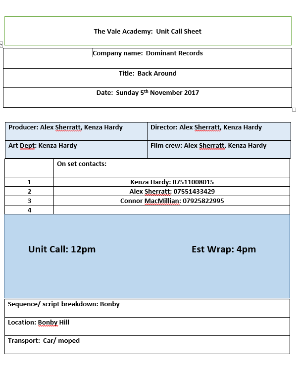
Sunday turned out to be a very short day for us. We only managed to film for an hour before the heavens opened. We thought Sunday would be fine for filming as it would be quiet in town and the weather forecast scheduled sunshine and said nothing about rain. The footage we got turned out good but due to the rain we have scheduled for Sunday 5th November at the same time of 12 pm.
Tuesday 31 October 2017


Monday 30 October 2017


Friday 20 October 2017


Subscribe to:
Posts (Atom)