
Friday 22 December 2017
Wednesday 20 December 2017

Monday 18 December 2017

Sunday 17 December 2017

Saturday 16 December 2017


Friday 15 December 2017

Thursday 14 December 2017


Wednesday 13 December 2017


Wednesday 6 December 2017

Tuesday 5 December 2017


Monday 4 December 2017
Research: Target Audience Final Video (Group Post)
We surveyed 11 people. 9 female 2 male.
1.Do you think the kicking of the gate is relevant?
Prefered encoded reading achieved: 3 said that it announces a dramatic entrance and shows he is angry and upset.
Negotiated reading: 4 said that it is confusing as he seems aggressive but the song isn't aggressive. They also said that it gives a negative view of the video although the video is good. He is also upset and angry
Oppositional reading: 4 said it is aggressive and the song is about love coming back and he is being aggressive.
1.Do you think the kicking of the gate is relevant?
Prefered encoded reading achieved: 3 said that it announces a dramatic entrance and shows he is angry and upset.
Negotiated reading: 4 said that it is confusing as he seems aggressive but the song isn't aggressive. They also said that it gives a negative view of the video although the video is good. He is also upset and angry
2. Does the artist portray the genre well?
Preferred reading: 11 said yes. "it follows the genre due to visuals and audio matching", "the dancing and goofy singing into camera represents love", "fun and upbeat", "he is enjoying what he is doing"
Negotiated reading: N/A
Oppositional reading: N/A
3. What do you understand about the story line?
Preferred reading: 6 said "he was in a relationship that didn't work and he misses her and wants her back", "he wants to spread love and positivity", "searching and questioning love, wants love to be spread and asking a previous partner to love him again", "wants to bring love back"
Negotiated reading: 5 said "more of a concept based video to a narrative", "not sure why the strangers are there", "is he upset because love is lost between him and someone else in the video"
Oppositional reading: N/A
4. Which shot do you like the most and why?
Preferred reading: 1"hand in the shape of a heart", 3"you, you, you", 3 "change of costume in field", 1"swinging around lamppost", 1 "walking back", 2 "pan of town"
Negotiated reading: N/A
Oppositional reading: N/A
5. Do you think there were the right amount of costume changes?
Preferred reading: 6 said "effective to the character", "if there were anymore it wouldn't be right", "fun and added nice depth", "there aren't too many which is good"
Negotiated reading: 2 said "simply but not necessary", "don't think it was needed, could have been different outfits"
Oppositional reading: 3 said "should have been more obvious as the outfits are similar", didn't grab attention as they were all similar", "had little effect"
6. Which colours do you think are prominent in the colour scheme?
Preferred reading: 2 Red, 6 Pink, 3 green, 4 neutral/ browns, 1 white, 4 black/ grey, 2 blue
Negotiated reading: N/A
Oppositional reading: N/A
7. What shots do you think symbolise this video?
Preferred reading: 1 "circling the lamp", 6 "holding up the signs" , 3 "hands making a heart", 2 "hand holding", 2 "singing into camera", 1 "artist center frame"
Negotiated reading: N/A
Oppositional reading: N/A
8. How well is the artist advertised in the video?
Preferred reading: 11 said "a positive person", "main focus", "advertised well as in almost every shot", "fun and quirky", "very well", " happy and bright", "enthusiastic and happy", " a loving person"
Negotiated reading: N/A
Oppositional reading: N/A
9. Do you understand what has happened in the main characters life?
Preferred reading: 6 said "he gets happier as he finds love", "relationship problems", "breakup, hurt feelings", "had love problems", "split with girlfriend and wants her back", "really wants love"
Negotiated reading: 2 said "lack of love or maybe a lot of anger?", "some suggest he is thinking about a girl, others he is thinking about love"
Oppositional reading: 3 said "no", "not really", "video seemed concept based", "bubble with Iona in not repeated so not clear enough"
10. Do you think when the artist changes emotions throughout the video it allows you to connect with him more?
Preferred reading: 2 said "we feel different emotions so more relateable"
Negotiated reading: 3 said "all the same although emotions shown makes it constant", "I thought he looked happy"
Oppositional reading: 6 said "I didn't see a shift in mood", "no obvious change although I connect with him more when he is having fun"
Negotiated reading: N/A
Oppositional reading: N/A
3. What do you understand about the story line?
Preferred reading: 6 said "he was in a relationship that didn't work and he misses her and wants her back", "he wants to spread love and positivity", "searching and questioning love, wants love to be spread and asking a previous partner to love him again", "wants to bring love back"
Negotiated reading: 5 said "more of a concept based video to a narrative", "not sure why the strangers are there", "is he upset because love is lost between him and someone else in the video"
Oppositional reading: N/A
4. Which shot do you like the most and why?
Preferred reading: 1"hand in the shape of a heart", 3"you, you, you", 3 "change of costume in field", 1"swinging around lamppost", 1 "walking back", 2 "pan of town"
Negotiated reading: N/A
Oppositional reading: N/A
5. Do you think there were the right amount of costume changes?
Preferred reading: 6 said "effective to the character", "if there were anymore it wouldn't be right", "fun and added nice depth", "there aren't too many which is good"
Negotiated reading: 2 said "simply but not necessary", "don't think it was needed, could have been different outfits"
Oppositional reading: 3 said "should have been more obvious as the outfits are similar", didn't grab attention as they were all similar", "had little effect"
6. Which colours do you think are prominent in the colour scheme?
Preferred reading: 2 Red, 6 Pink, 3 green, 4 neutral/ browns, 1 white, 4 black/ grey, 2 blue
Negotiated reading: N/A
Oppositional reading: N/A
7. What shots do you think symbolise this video?
Preferred reading: 1 "circling the lamp", 6 "holding up the signs" , 3 "hands making a heart", 2 "hand holding", 2 "singing into camera", 1 "artist center frame"
Negotiated reading: N/A
Oppositional reading: N/A
8. How well is the artist advertised in the video?
Preferred reading: 11 said "a positive person", "main focus", "advertised well as in almost every shot", "fun and quirky", "very well", " happy and bright", "enthusiastic and happy", " a loving person"
Negotiated reading: N/A
Oppositional reading: N/A
9. Do you understand what has happened in the main characters life?
Preferred reading: 6 said "he gets happier as he finds love", "relationship problems", "breakup, hurt feelings", "had love problems", "split with girlfriend and wants her back", "really wants love"
Negotiated reading: 2 said "lack of love or maybe a lot of anger?", "some suggest he is thinking about a girl, others he is thinking about love"
Oppositional reading: 3 said "no", "not really", "video seemed concept based", "bubble with Iona in not repeated so not clear enough"
10. Do you think when the artist changes emotions throughout the video it allows you to connect with him more?
Preferred reading: 2 said "we feel different emotions so more relateable"
Negotiated reading: 3 said "all the same although emotions shown makes it constant", "I thought he looked happy"
Oppositional reading: 6 said "I didn't see a shift in mood", "no obvious change although I connect with him more when he is having fun"
Planning- Promotional Ideas Outcome
In my previous post, i saw that a video had used the album cover of the artists digipak as an end screen. I really liked this idea and are going to put it in the top right hand corner of the screen as the end title slide is scrolling through.
Track List
Alone
Back Around
Standing There
Seeing Red
Till it’s gone
Let’s talk about the future
Grey skies
Feeling Blue
Then and Now
Speaking loud
Here in time
This is now
Sunday 3 December 2017
Target Audience Research on Ancillaries 1
We asked three 17 year olds, one males and three female, to
analyse our ancillaries. This included our Advert and Digipak. I asked more
than three people originally however, these were the most useful answers.
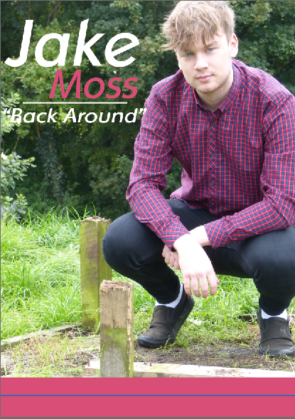
Advert
1. They said that the forced blur around the hands needs to
look more natural as it stands out too much.
Action: we can change the opacity of the image to make the
blurs less harsh.
2. They said that the colour of the hands and the face needs
to be duller.
Action: Change the saturation of the face and hands.
3. We need to move him down as his head is cut off at the
top.
Action: move the image so all of his head is showing.
4. They did not understand the link to looking sad in the
ancillaries and happy at the end of the video.
Action: The story is he is alone and needs help. The video
is all about him finding help to spread love and realising he can live without
a girl’s love if he has people around him for support.
5. There needs to be a range of fonts used on the advert.
Action: change the fonts to suit genre but have a range of
fonts.
6. The fonts also need a variety range in colour.
Actions: add some more synergetic colours
7. They could not understand why there was a line used.
Acton: line is there to crate sections and make it easier to
read
8. There is a hole where text could go.
Action: We are going to put a picture of the album cover in
this gap.
9. The text for his name looks stretched.
Action: resize the text
10. Need to put the institution name on advert, not just
logo.
Action: Add the record name.
Digipak -
Front Cover: the image seems a bit burnt out and his name
seems too out of the way.
Action: We can do this by changing the brightness of the
colour scheme as well as desaturate some of the colours so it makes the photo
look a bit darker. We will also Move the font to in front of him and make both
"Jake" and "Moss" the same size font.
Back Cover: There is too much green, there is also no
relation with the viewer and we need a barcode, price and font.
Action: To fit with what our audience has said we could
develop a layer mask on the image and desaturate the green slightly to maintain
his brightness as well as reducing the amount of green in the image. We will
need to add the institutional details (price and barcode)
Left Cover: The image does not fit in the box and they do
not like how close up the image is.
Action: We will get the image again and crop it perfectly to
fit inside the box. The image could be brought back a bit.
Left Cover 2: The image of the hands does not fit in the
box.
Action: We will change the sizing’s of the photo of the
hands and make it fit perfectly inside.
Back Inside: Too green.
Action: we will bring out some of the colour and make the
image less green.
Cover Inside: No connection between the image and the music
video. Too similar with the back inside. Makes no connection with audience.
Action: Change the image and link it to another section of
the music video.
Saturday 2 December 2017
Planning: Our actions prior the Target audience research 6 (Group Post)
Planning: Our actions prior the Target audience research 6
What have we changed after the target audience research from draft 4?
- The banners opacity and colour has been changed. We thought this would look aesthitically pleasing so, all the boxes highlighting words have had the opacity changed to 70%.
- The size of the Digipak front cover is alot smaller now.
Friday 1 December 2017
Research: Target Audience 1 on Advert Draft 4 (Group Post)
We asked a few members of our sixth form if they preferred a pink, purple or see through banner for the advert.
(Female 17) - "I would like a vibrant colour with a slight see through aspect to it."
(Male 17) "I like the pink colour because it links well with his shirt and the text on the page."
(Female 17) "I think it would look good if you were to change the opacity slightly just so you can see the rural visuals in the background."
We also asked what they thought about the advert in general.
(Female 17) - "I really like how the colours all relate really well. Only thing I would change is the size of the front cover."
(Male 17) - "The colour scheme is great and develops the synergy well. his face seems quite bright, maybe you could edit the photo slightly to tune down the lighting slightly."
(Female 17) - "There are many great parts of this advert I really like. For example, the colour scheme and natural green background. The only bit I don’t like is how large the front cover is and how bright the banner is."
Subscribe to:
Posts (Atom)